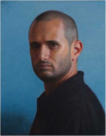
![]()
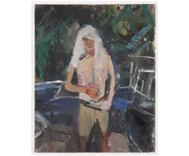
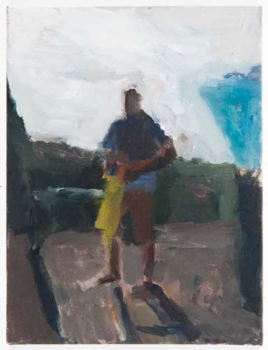
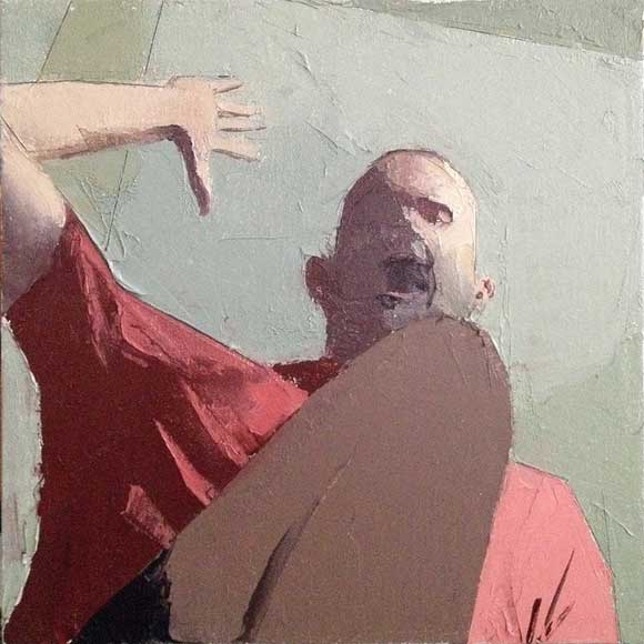
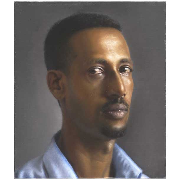
Aram Gershuni, Man in a Blue Shirt,, oil on linen on wood, 35 x 30 cm, 2012
click here for a larger view
by Elana Hagler
Aram Gershuni, born in 1967, is a mainly self-taught painter who lives and works in Tel Aviv, Israel. He studied privately with Israel Hershberg, and at the Jerusalem Studio School (1997). Gershuni’s first solo exhibition took place at the Alon Segev Gallery in 2003. His second solo exhibition opened at the Tel Aviv Museum of Art in 2009, to great acclaim. He has participated in many group shows in galleries and museums, including the National Portrait Gallery in London, the Tel Aviv Museum of Fine Art and the Israel Museum. Work by Gershuni is included in many public and private collections in Israel and abroad, including the collection of the Israel Museum, the Tel Aviv Museum of Art, and the Supreme Court of Israel. Aram Gershuni has taught drawing and painting in many institutions in Israel, including the Bezalel Academy of Art and Design (1997-2004), the Jerusalem Studio School (2004-2006), and “HaTahana” school in Tel-Aviv, which he co-founded, and where he still teaches.
We conducted this entire interview in English, even though it is not his native tongue. This was a big boon for me, as my Hebrew is quite laughable.
Elana Hagler: Could you talk a little about what the act of sustained looking means to you?
Aram Gershuni: If I had to – like Rabbi Akiva – essentialize what it is all about, I would use the word “Attention”. In Hebrew that works even better: the equivalent expression, “Tsumat-Lev” literally means putting your heart into it. But I think the question actually has two parts: the “sustained” part and the “looking” part. The two are interconnected, at least as far as I’m concerned, but not inseparable. So I’m going to try and treat them separately, for clarity’s sake.
“Looking”, observation, is of paramount importance to me. My whole painting discipline has been built on direct observation. I’ve been attracted to it right from the get-go, and for years I would only paint with the motif (“the nature”, “the model”, whatever you call it) right there in front of me for every second that it took to make the painting.
![]()
Girl with Grey Eyes, oil on wood, 31 x 30 cm, 2010
AG: (cont.) I’m sure many readers of this blog are themselves practitioners or veterans of “painting from life”, and are well aware of its many and various attractions and frustrations. I would like to make a few points about it though.
My first point – which should be obvious but really isn’t to most beginners and students, and even to some experienced painters – is that observation is not an end, but a means. Countless times I’ve seen students put a certain something into a painting in a certain way that would never work, “because it’s there,” or because “I see it.” That sort of attitude is counterproductive, but many students fall into this trap. When we paint from observation, we are not reporting, we are not witnesses in court, sworn to tell “the truth, the whole truth, and nothing but the truth;” we are not trying to pass along information. Rather, we are using observation to energize the painting, to make it come alive. I have come to think of observation as a sort of gas station that you come to with your car when you’re running low, or a well that never dries, that you drink from to quench your thirst. You only drink when you are thirsty, and you don’t have to drink the well dry, nor could you if you tried.
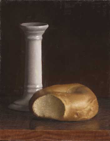
![]()
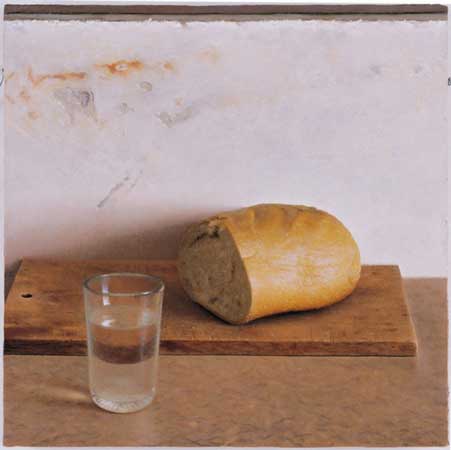
Bread and Water, oil on wood, 40 x 40 cm, 2005
Our one, our only responsibility, is to the painting we are making, not at all to “what is there” or even to “what we see.” So my second point is we need to learn to see “through” the painting, “through” the medium. It really feels like I’m seeing tonally “in black and white” if I’m drawing in charcoal, for instance, or that my seeing is bigger and broader if I’m holding a bigger brush, to give just a few obvious examples. But on a much subtler level, too, I need to see at any given moment only what can be absorbed and assimilated by the painting at that particular moment: to be blind to everything else. This is very active looking. There is nothing passive about it.
Only by asking the model a question, will we get an answer. The more specific the question, the more accurate will be the answer. And the question arises from, and is formulated by, looking at the painting vitally: not by passively gazing at the model, nor by mechanically making measurements of who-knows-what, as I see many students doing.
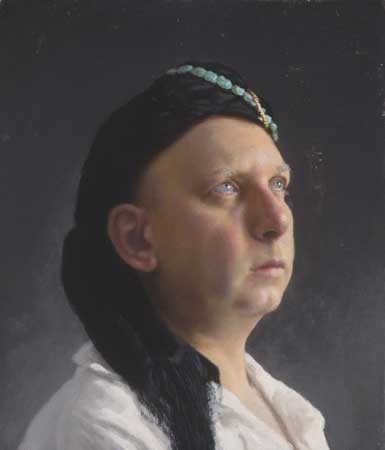
![]()
Man with a Turban, oil on wood, 35 x 30 cm, 2011
When we are able to “see through the medium,” it allows us to travel into an abstract world of visual phenomena, a sort of parallel universe where regular, “survival-mode” vision loses its hold on our minds. Losing myself in this world of phenomena, immersing myself in it, is for me one of the great joys of painting from observation.
One must indeed “see the painting as a reality and the reality as the painted thing,” as [William Merritt] Chase was fond of saying – according to Hawthorne – so one side of it is seeing reality as just spots, possessed of very particular shapes and tones and hues and so on. That’s a very difficult thing to do; it takes a lifetime of training. But my third point is that this is only a half, or a third, of the equation. You also have to “see the painting as the reality;” that is, you need to use the mimetic function of the painting in a kind of game of make-believe, in which you enter the “world of the painting” and dwell in it. This side of the equation tends to be neglected, but it is just as needful of training and practice as the other side. Every time you put down a mark, there’s a new painting, and you are that painting’s first (and usually only and last) viewer. And that viewer needs to be just as highly trained, just as alert and sharp, as the one who takes measurements or the one who makes the marks.
It’s a three-part cycle that needs to be completed and repeated over and over again, uncountable times for even the simplest drawing or painting: measuring – manipulating – evaluating. And by measuring I don’t mean mechanical measurements. Rather, every look at the model is, or should be, some form of comparative measuring: of angles, or proportions, or tones, or hues, or some other aspect of visuality. Then, there’s the manipulation of the medium—graphite, charcoal, oil paint, whatever it is—putting it down, moving it around, taking it off, and so on. But it is the evaluating part which I’ve come to think of as perhaps the most important component of the whole operation. I think that all of our problems in drawing or painting stem from not looking enough—critically enough, sensitively enough—at the actual drawing or painting, while we probably look at the model too much!
[French phenomenological philosopher Maurice] Merleau-Ponty says somewhere: “Seeing is keeping at distance.” We need to put that distance between ourselves and the painting we are working on at the moment, and that distance is not just spatial (although that’s very important, too) but also temporal, as well as mental and emotional.
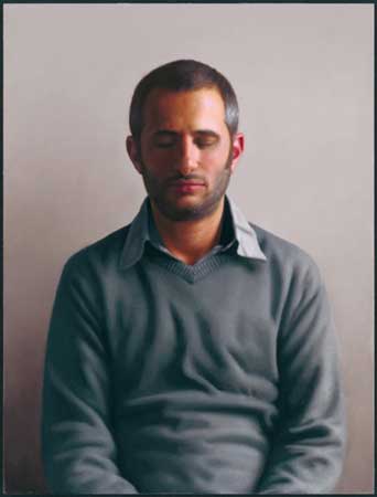
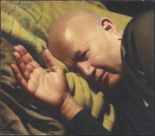
![]()
Self-Portrait with Eyes Closed, oil on wood, 75 x 57 cm, 2009
I’m very fond of the following quote, which comes from none other than Sir Winston Churchill:
“We look at the object with intent regard, then at the palette, and thirdly at the canvas. The canvas receives the message dispatched, usually a few seconds before from the natural object. But it has come through the post-office en route. It has been transmitted in code. It has been turned from light into paint. It reaches the canvas a cryptogram. Not until it has been placed in its correct relation to everything else that is on the canvas can it be deciphered, is its meaning apparent, is it translated once again from mere pigment into light. And the light this time is not of Nature but of Art. The whole of this considerable process is carried through on the wings or the wheels of memory. “
This dovetails quite nicely into the “sustained” part of your original question. Over the years I have found that – for me – it is this “evaluating” component of the tripartite system of observation that I’ve been trying to describe, which is truly crucial. And this is what really takes time; not the measuring bit, the actual looking at the model, certainly not the “manipulating” paint and making marks bit. I’ve first noticed this through examining closely the kind “after-image” that I have in my mind’s eye after a long and intense working day, an image that is very clear and lively, that sometimes seems to be etched on my retina. I’ve realized that this is an image of the painting itself(!), not the model, the nature. This means that I am spending the by far greatest part of my time in front of the easel just staring at the work in progress.
This gradual realization had a liberating effect on my work, I think. All painting, as Churchill so aptly says, is done from memory. There is no such thing as truly “direct” observation. So, if my first—nay, my only—obligation is to the painting, not the model, then I can utilize my memory (all kinds of memory, really: short-term, long-term, visual or not) to work away from the nature, to work from reference (be it photos, sketches or drawings done from life, or whatever combination), from imagination and invention, and basically just let the painting tell me what it needs.
I still try to do all that “as if” I was painting from life, even when I’m not. This, for better or for worse, is where I am coming from.
Even quick, alla prima sketching (which is something I do, just for myself) involves much sustained looking, compared to our regular “survival mode” seeing—which is a form of blindness, really. But I have always been drawn to these very prolonged, sometimes protracted processes that you can have in painting. I guess if doing a painting is like having a relationship (and it is), than I have been investing in these long-term relationships: as difficult as that sometime is, and as nice as it may be to have an affair or a one-night-stand, I need this long-term relationship, this marriage, with the intimacy and depth that go with it. Nothing else is as challenging—for me—and as satisfying. I want to watch the newborn painting in its charming infancy, its turbulent teens, and to accompany it as it matures, grows old, and eventually dies. I want to go through the whole cycle.
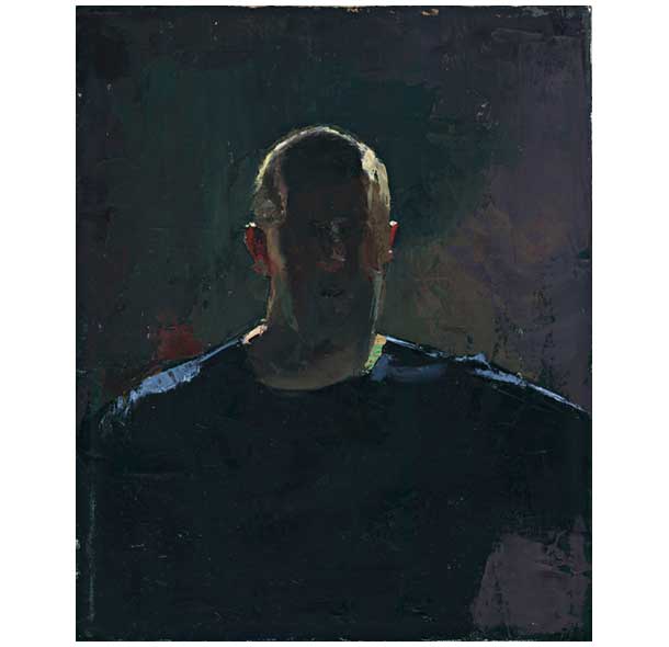
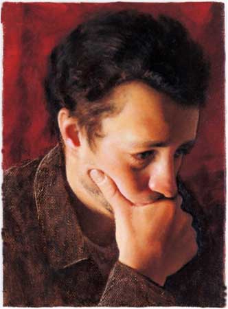
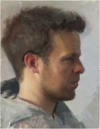
![]()
Head of a Man, oil on linen on wood, 30 x 25 cm, 2012
In my formative years, when I have made myself purposefully dependent on “direct” observation, it was hard to find motifs that would stay available and unchanging long enough for me to paint them the way I wanted to paint. So that basically meant doing still-lifes almost exclusively, with the occasional self-portrait from the mirror thrown in. It was only after coming to rely less on “direct” observation that I was able to fully engage with other themes, such as portraits and landscapes. The way I wanted to paint, my relationship with the painting: that took precedence over subject-matter and my relationship with nature.
I still try to paint as fast as I can, though. Velocity in painting, as in physics, is not measured by units of time alone, but rather by the distance traveled, divided by the time it took to do so. There is nothing slow about it, no matter how long a time it takes. The painting is always in a state of emergency, in both senses of the word.
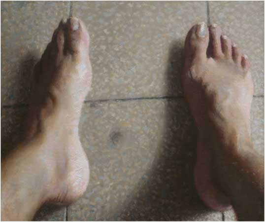
![]()
Self-Portrait (Feet), oil on wood, 30 x 25 cm, 2012
EH: What is it that moves or excites you the most visually or formally in painting…either in your own process or when looking at other people’s work?
AG: tend to emphasize the formal, abstract side of my painting process, because that’s the side that most people who do not practice painting often miss. And I certainly accentuate it a lot when I teach, for much the same reasons: that is, the “looking at the reality as a painting” side of things. But it’s never just that, is it? On the other hand, I never think of my work as being figurative, or realistic, or photo-realistic or hyper-realistic or any of that nonsense (I tend to cringe when I hear those terms). Nor am I interested at all in any kind of narrative or declarative message in painting.
What I am after—as far as I’m aware of it—is a certain sort of presence, a “real presence” which can only be achieved in that “in-between” domain where, if I am painting a chair, let’s say, then the painting IS that chair, while (and precisely because) it is at the same time a totally different object, one which has a flat surface with some colored paste smeared on it. And so the painting, when viewed properly, ceases to be either.
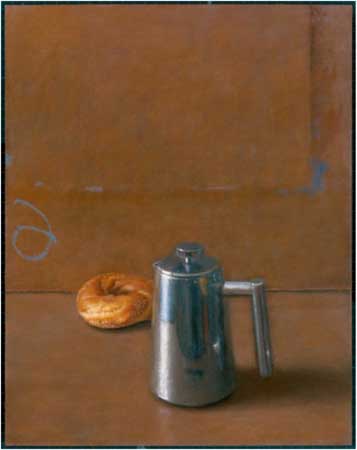
![]()
Bagel and Candlestick, oil on linen on wood, 25 x 20 cm, 2012
This is really difficult to put into words, perhaps not even possible. I can only describe it negatively, say what it is not. Heidegger talks about it quite marvelously in his Der Ursprung des Kunstwerkes, if you can cut through his rather thick lingo.
And I can recognize it and respond to it in other people’s work. It’s a kind of an epiphany, in the sense that Joyce describes in Portrait of the Artist as a Young Man, and it leaves an indelible mark on you. I cannot say it, but I know it in my bones. It has nothing to do with a particular style or manner or -ism.
As far as my own work is concerned, I don’t know, of course. After spending countless hours of staring at the work in progress, I can’t even bear to look at the finished painting.
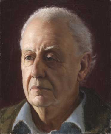
![]()
Portrait of Ilya Gelfter, oil on canvas mounted on wood, 34 x 20 cm, 2006
EH: I can definitely relate to the relationship with the painting getting so intense that you cannot stand to have it in sight anymore. Usually, I can never appreciate a painting right after I finish it; like in your relationship metaphor, our relationship improves with some time apart.
How have your painterly ambitions changed and evolved over the years?
AG: Well, I’m honestly not sure they have. As a child I drew and painted a lot from imagination, or what is thought of as such. But ever since it occurred to me that one could work from observation that is what I wanted to do! Of course I didn’t have a clue as to how to do that well, so I started teaching myself by trial and error. And I’m still doing that.
And when you look at even my early childhood drawings from a purely formal, compositional point of view, you can see the similarity to what I do now. That’s kind of scary…
I remember going to the Lucian Freud retrospective at the Tate Britain (ten years ago or so?) and seeing almost sixty years’ worth of his work, and thinking that it was obvious that he had always tried to do the same thing, right from the start, and even the seemingly radical changes that his work went through in his forties and fifties were only superficial. He just changed his ways and means—big bristle brushes instead of small sable ones, standing to paint instead of sitting, etc.—to try to do the same thing, in what he thought of as a better—or different—way.
Freud was always a good role-model for me, ever since I discovered him for myself when I was 19 or 20. I think we all keep trying to paint this one and only picture, an endeavor doomed to failure, of course, which is why we go on. “Perhaps the next one?” we say to ourselves over and over again. It’s a necessary illusion.
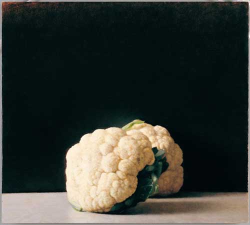
![]()
Cauliflowers, oil on wood, 49 x 45 cm
After twenty years or so of painting seriously, when the time came for my solo show at the Tel Aviv Museum of Art, I put this quote from T. S. Eliot as frontispiece to the catalog. It is from the “Four Quartets” (first half of the fifth “movement” of “East Coker“, the second Quartet):
“So here I am, in the middle way, having had twenty years-
Twenty years largely wasted, the years of l’entre deux geurres-
Trying to learn to use words, and every attempt
Is a wholly new start, and a different kind of failure
Because one has only learned to get the better of words
For the thing one no longer has to say, or the way in which
One is no longer disposed to say it. And so each venture
Is a new beginning, a raid on the inarticulate,
With shabby equipment always deteriorating
In the general mess of imprecision of feeling,
Undisciplined squads of emotion. And what there is to conquer
By strength and submission, has already been discovered,
Once or twice, or several times, by men whom one cannot hope
To emulate – but there is no competition –
There is only the fight to recover what has been lost
And found and lost again and again: and now, under conditions
That seem unpropitious. But perhaps neither gain nor loss.
For us, there is only the trying. The rest is not our business.”
The “Four Quartets” are among of the most important texts in my life. I know them entirely by heart and they have become almost a part of my nervous system, and I still remember the shock of recognition that went through me as I read the above quote (It’s even better in context). He is talking about poetry, but you could easily substitute in painting. Even the number of years was right for me at the time, and the attitude: exemplary.
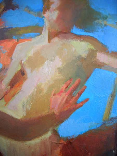
![]()
Self-Portrait (Over the Shoulder), oil on wood, 2008
EH: It’s interesting what you said about how your childhood drawings have this strong connection to the more mature art that you are making now. I have always enjoyed looking at Seurat’s childhood drawings, and seeing how strongly they relate to his later, more well-known work. And he had this funny academic period in between…so there was this definite thesis—antithesis—synthesis! I am a big believer in those earliest inclinations being a sort of deep set of clues for what we are meant to do. We go to art school, or learn from the Masters, and in this process of learning how to paint, we get wrapped up in various concerns and develop a series of skills, and then realize that, somewhere along the way, we might have lost touch with what set us on this journey to begin with. And that’s when it becomes so valuable to get in touch with those original, more naïve, and yet somehow closer to the source, instincts.
What are the most valuable technical skills or tools you have discovered for yourself through your own painting experience?
AG: I have this irresistible urge to tinker with my methods—always trying new elements or new combinations of the same elements—so no two paintings are ever exactly alike in their evolution, and I often have to paint myself out of some fiasco. I often change my mind about these things, having a Eureka moment one week, only to discard that revelation completely the next week, only to salvage it again some years later. When my students accuse me of inconsistency, I tell them that it is only a very shallow person who can even pretend to be completely consistent, and that—in all humility—I do not consider myself to be such a person. I sometime change my mind right in the middle of a painting, which feels as if I’m doing a U-turn right on the highway!
Really, the most important asset a painter can have—technical or not—is a kind of grim determination….
Having said that, there are some patterns that are starting to emerge, after all these years. One of them seems to be that the simplest things work best. “Keep it simple” is a really good piece of advice. My methods these days are fairly straightforward, fairly direct, hardly involving any glazing or scumbling or indirect, multi-layered operations. No fancy medium (or actually no medium at all, just paint out of the tube, pretty much).
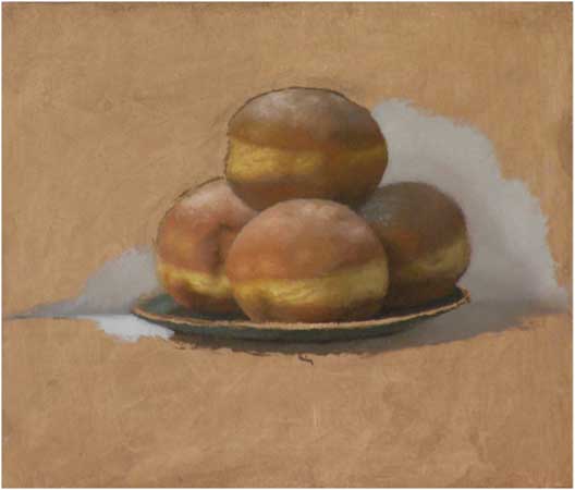
![]()
Evening Class Demo, Sufganiot, 2010
I tend to do some seriously elaborate drawing, and underpainting (which is really a continuation of the drawing), and maybe some sort of ebauche.
All this is like creating a map to by which to navigate. Like a map, it needs to be complete, precise, and clear (sometimes, it is nice to jump in with no map at all, though, just for the hell of it). Then, I just go in and try to paint things as directly and solidly as I can, whatever it takes, always striving to stay conscious of “the big picture”.
Most of the work is done on the palette, mixing carefully, laying down spot by spot, trying to put the right color in the right place. I think of this as “Pure Painting.” It’s doing things the hard way. No shortcuts. I respond to this element quite strongly in the work of others, too. That is one reason why I am so attached to the work of Euan Uglow, and to that of Antonio Lopez, who each give a wonderful paradigm of this “Pure Painting,” in their different ways. But unlike them, I am also very interested in edge variety, so I do quite a bit of manipulation of adjacent spots, once I have laid them down. On top of that, I would maybe do some more refining and correcting, if needed.
![]()
Evening Class Demo, 2011
And that’s basically it, put as succinctly as I can. This is pretty much the same thing I do when I learn a new piece on the piano. First, I sit down with the score, away from the piano, trying to get some sense of the whole, of where things fit in, of where the whole thing is going. That would be the equivalent of the drawing and underpainting stages, roughly speaking. Then I break the piece into short bits or phrases, and I start practicing them one by one, starting at the beginning of the piece (or sometimes starting with the most difficult bits, similar to the way I would—in a painting—start with some “center of interest” to key the whole painting to).
If a certain phrase is too difficult, I break it down even further, practicing hands separately, or slowing waaaaay down, using every trick at my disposal to get it right. And then I go on practicing that particular morsel, until I get to the magic moment where my hands just play it by themselves: no need to read the notes, no need for any conscious effort.
Once I have a few fragments mastered like that, I start clustering and overlapping them together into bigger and bigger “chunks,” until I have the whole thing down. And from there on I just keep refining, listening intently, trying to make it seamless, and pouring all the musicality I can muster into it.
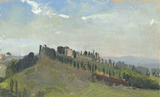
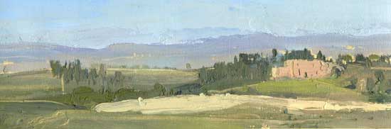
Of course, each piece needs individual treatment. You don’t learn a Bach fugue in exactly the same way you would a Chopin Waltz. And so it is with painting: different motifs demand different treatments, sometimes a complete reinvention of technique. Landscape, for instance, makes very different demands than the kind of still-lifes and portraits that I’ve been concentrating on. I’ve been completely floored by it on my first few tries, and I’m still kind of groping my way.
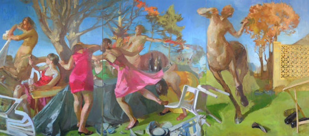
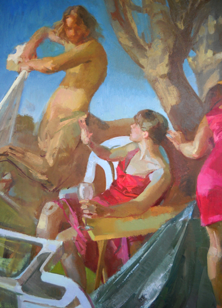
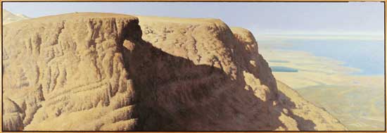
![]()
Distant Relative, oil on wood, 90 x 270 cm, 2006-2008
EH: What is the most helpful advice anyone ever gave you when it comes to painting? If you can’t choose one example, by all means give more!
AG: I’m afraid I’m not much given to asking for advice, nor do I ever volunteer advice, if I can help it. I don’t think it works that way. If you have a hero, a role model, a mentor, you should look for her example, not her advice. And maybe strive to emulate that. So all I have are lots and lots of bits and pieces that I have soaked up here and there, and put together for myself, and can’t even remember how I got them. I can’t, if truth be told, think of just one particular thing from one particular person. Now that would be neat, wouldn’t it?
What comes to mind as I write this, is an “advice” (an injunction, actually) that I repeatedly give myself these days. It comes from Eckhart Tolle’s description of his moment of spiritual crisis and transformation. At that moment, he states, he heard this “voice” saying to him very clearly: “Resist nothing!” This resonated and stayed with me.
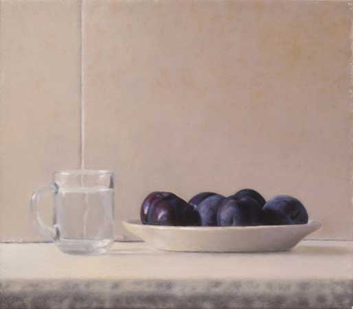
![]()
Plums and Water, oil on panel, 35 x 40 cm, 2011
So that is my constant injunction to myself these days. “Resist nothing!” If an idea suddenly occurs to you, if you have an urge or crave or a need to try something odd or just plain silly, it is there for a reason. If you seemingly “made a mistake,” there must be something in that, too.
Time and again I’ve found that my most basic, most primitive intuitions in painting—the ones I later rejected because I deemed them too simple, too naïve and childish, or they did not conform to accepted wisdom, or whatever—were actually what I needed the most. I just wasn’t ready for them yet.
And when teaching, it becomes even more obvious: there is a reason why this common mistake is almost everybody’s instinct, and not that. We, as teachers, tend to rush in and try and make the students realize their “mistake:” compel them to do the counter-intuitive thing. But there is some truth in the basic premise they start with, a truth waiting to be explored.
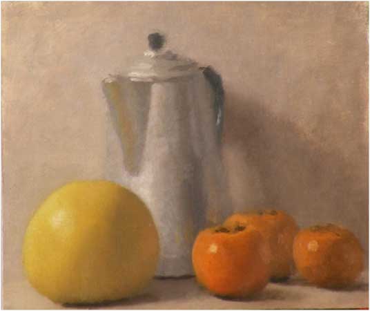
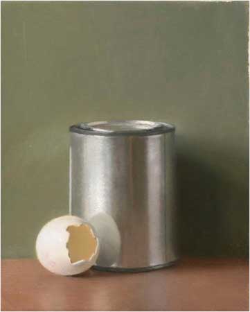
![]()
Egg and Oil, oil on panel, 30 x 25 cm, 2012
EH: You come from a family of celebrated artists. I’m sure that you are sick of talking about your family, since your association with them is so well-known in Israel, but here in the US I think it will be new information for many people. What has it been like for you to find your own artistic voice and vision in a legacy situation as an artist?
AG: You’re right: I am sort of tired of talking about that, and it’s a long story, and it’s not even all that relevant or important to me anymore, and it would be hard to make people who do not know the context of Israel and Israeli art understand it without going into too much detail.
So I thought I would offer you a more general kind of insight, maybe even universal, since you ask about my father and mother, and everybody has mothers and fathers to contend with.
I start with the distinction that Erich Fromm—in his wonderful book The Art of Love— makes between a father’s love for a child, and a mother’s love. A father’s love, he says, is conditioned on the child’s growth and achievements. The more the child achieves, the more the father loves him. A mother’s love, on the other hand, is essentially unconditional, regardless of the child’s accomplishments and traits. Both kinds of love, Fromm argues, are necessary for a human being’s healthy, normal growth (of course, Fromm recognizes that things are hardly ever this neat and schematic in real life).
![]()
The Final Addition, 0il on canvas mounted on panel, 35 x 40 cm, 2011
In my own growth, I’ve come to realize that painting has always signified for me a potential to satisfy my craving for love. The better I painted, the more “my father” would love me. Not only, or even particularly, my own actual flesh-and-blood father, of course, but a father-figure, not necessarily male, projected (on some teacher, or friend, or rival, or critic, or the general public, or the universe at large, or god, or all of the above, anything outside myself) and eventually internalized.
And so, I strove very hard to get better. But at a certain point I began to slowly realize that this will not do: that no matter how well I painted, how much attention and praise and recognition I garnered, this would do nothing to soothe that craving for love. Quite the contrary, it made the lack even more apparent. For what I was deficient on was motherly love (as defined by Fromm). Again, not necessarily in relation to my own actual mother, but I was missing that unconditional love, love for me as I am, regardless of what I did or didn’t do, achieved or failed to achieve.
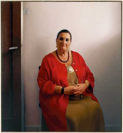
![]()
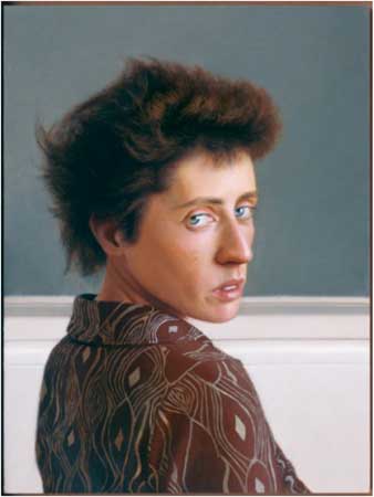
Portrait of Bianka Eshel-Gershuni, oil on canvas mounted on wood, 160 x 150 cm, 2007-2008
And I was (and maybe still am) projecting that sense of loss, of Sehnsucht, on everything and anything around me.
This is a bitter pill to swallow, but for me, something quite miraculous happened along the way, as a kind of side effect: painting itself, the practice of painting, the daily routine, became a way of truly meeting myself, meeting my true self, inhabiting myself, and slowly, slowly learning to love myself unconditionally, to even hope to love others in that way too.
We were talking about distance before, and painting, for me, is an opportunity for the practice of finding and maintaining the right distance, which is the distance of empathy, poised between complete identification on the one hand, and complete alienation on the other. This practice has had, and continues to have, a very healing effect on me.
![]()
Unfinished Study
EH: That’s beautiful, Aram, and certainly something that I have struggled with myself. I’m not totally comfortable with the labeling of these two distinct types of love as “fatherly” and “motherly,” but however you want to label them, I certainly identify with the main thrust what you are saying. This drive to achieve, and somehow prove oneself, even if it originally comes from an external source, can become so deeply internalized that finding true self-acceptance becomes a monumental task. And it is funny how sometimes life’s greatest challenges can in hindsight also pave the way for life’s greatest rewards.
Has becoming a father and family man affected you as a painter? If so, how?
AG: I am pretty sure that if I was interviewed by a man, it wouldn’t even have occurred to him to ask me that! I’m so delighted that you have, and, in a way, that is the answer to your question already.
I became a father at what is now considered a relatively early age (28). I am not certain I would have even reached my present age (45), if I didn’t have a wife and family. I would probably have burnt out by now. Having a family balances things out, it grounds and anchors me in this life, and though it is a constant struggle to find that balance and keep it, I am very thankful for it.
I can’t point to anything in particular in my painting that has been influenced by having a family, though, since I have nothing to compare it to, no way of knowing how it would be otherwise.
![]()
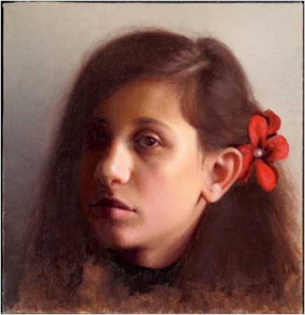
Portrait of Alma Gershuni, oil on canvas mounted on wood, 31 x 30 cm, 2009
![]()
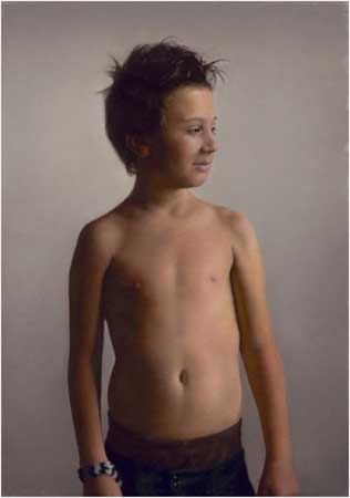
My Son, oil on panel, 60 x 42 cm, 2010
The only obvious thing is the portraits of family members, of which I did more than a few. Not just my wife and children, but also my parents and siblings, and myself. I’ve always been interested in the convention of formal portraiture, which became already quite rigid by the 19th century, and I guess I was intrigued by the possibility of painting my most significant others from this inexorable detachment that the convention generates, while at the same time bringing into it that brand of intimacy that only painting from life offers, even when you’re painting a complete, random stranger.
![]()
Portrait of Sharon Etgar, oil on board, 44 x 33 cm, 2007
EH: You founded an art school, HaTahana Studio for Figurative Arts, in Tel Aviv. What has it been like to build a school from the bottom up?
AG: It is a more than a bit of an exaggeration to say that I have founded “HaTahana” (the Hebrew name means “The Station”). Rather, it is something that somehow emerged, over several years, around me. There was a demand, that I eventually complied with, and the school just grew from that. If anyone “founded” anything, it is my wife Liza—without whom none of this would have happened—who continues to direct and stir the school through troubled waters with a firm hand, while also expanding into new ventures. I’ve also had and continue to have the great privilege of co-working with some of the most brilliant painter-teachers in this tiny corner of the world.
I have learned so much from teaching! I admit to not caring all that much about what specifically my students actually learn. My working assumption is that where and when I learn the most, they will also learn the most. So far this assumption has borne itself out, I think.
In a way, it is impossible to teach painting. Each of us can only teach him/herself, by practicing. My job as a teacher is to help the student teach her/himself, to practice, in a much more efficient way than he or she would on their own.
Which goes a long way to explain why I think painting cannot really be taught in an art-school, university-like system, the way it is taught in most places nowadays. It’s a very different conception of teaching. Not better or worse, mind you, just different: more suitable for achieving certain results, less suitable for achieving others. I use Rumi’s parable of drilling a well when I try to illustrate the difference:
Suppose you wanted to drill a water-well in your backyard or field. According to the University notion, the all-important thing is placement. So after some research, you start drilling in the most likely place. If you don’t strike water almost at once, you should try somewhere else, according to this world-view, and so on. Ultimately, you would have a field full of holes, most of them pretty shallow, one or two of which may even flow with water.
According to the other, more traditional (?) method we try to adhere to, placement is unimportant. You can drill anywhere. What’s crucial is to keep digging no matter what, to just go deeper and deeper. Eventually you would strike something, maybe not water, but something: rock, oil, coal, diamonds, who knows…
I try, in designing a course for the master class at HaTahana, to approximate—as much as is possible in a class format—my own learning processes which still go on at the studio (perhaps this is the closest thing you can have nowadays to the apprentice system of the Old Masters, which achieved such incomparable results). This enables me, I hope, to bring as much of myself as possible into the class, instead of just a little.
As time goes by I am engaged more and more—as a teacher—by the efficacy of teaching by example. “Zeigen, nicht sagen” is Wittgenstein’s pithy dictum, and I try to follow it as best I can. Which could mean anything from working on a student’s drawing or painting (sometimes totally demolishing it to the horror of everyone present), to sitting in with the class and just drawing or painting with the students from the pose they are working on (something I do a lot of that) to giving full-blown demonstrations and illustrated lectures. Working on the students’ own pieces, especially, has taught me so much! (And the students might have learned something too….)
I certainly feel very lucky and privileged to be able to teach in such an accommodating and supportive environment. I quit all other teaching jobs a long time ago, when this thing took off, and I have not regretted any of it once.
EH: From what I understand, Israeli visual culture has not traditionally been friendly to art grounded in the historic Western tradition of realism. My personal take on this is that it has to do with a two-fold cause: first, a Biblical prohibition against idol-making…which has sometimes been interpreted as a prohibition again depicting the human figure; and second, a desire to reject the “faux-civilized” relics of European history when Europe showed itself to be anything but “civilized” in its relationship with the Jewish people. Would you agree with this assessment? I would love to hear your thoughts on this issue and also whether you think that this stance is at all beginning to shift in Israel.
AG: Well, your theories ring true to me, though I am not really qualified to say one way or the other. I can’t say that I have had much familiarity with that particular strain of iconoclasm, purportedly inherent in Judaism, which you are talking about. But the other cause that you mention, yes, certainly, that strikes very close to home.
Actually, you were asking before about the artistic household I grew up in. My parents (especially my father, who was at the time a conceptualist and minimalist, and was very much politically involved when I was a boy in the seventies and early eighties) were living the modernist dream. And while I’ve had nothing but encouragement from both of them for the way I wanted to paint, I certainly had to rid myself of a lot of baggage I had accumulated early on from my immediate artistic environment. It was like throwing sandbags out of my hot-air balloon so that it could ascend.
Israel, as a country, was pretty much born with Modernism. It had nothing to do with what went on here before. It had no tradition of any kind of visual art, let alone figurative or realist or whatever you call it. And it was beleaguered on all sides, so everyone had to be a good little soldier; any deviancy was more than frowned upon. It made for a kind of Bolshevik mentality. And Israel had socialist aspirations… All this was somewhat before my time, and is certainly different now.
But this rejection you are talking about was going on all over the world. It was just compounded here in Israel. Here, there was barely anything to reject, to begin with.
It’s all certainly changing now, in the Israeli art-scene, as it is changing all over the world. It has been changing at least since the arrival of Israel Hershberg on the scene, who immigrated from the States in the late eighties (just in time for me—as I was beginning my own independent exploration—to latch unto him with all the tenacity I had). The field was ripe for it, I’m sure, but Israel certainly galvanized it. He represented a direct link to a tradition that had never existed here, but was somehow still unbroken and alive—though much maligned and disenfranchised—in America and Europe.
![]()
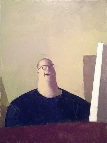
Man in White Shirt, oil on wood, 29 x 23 cm, 2010
I sound to myself like an old man when I tell my students now that they don’t know how lucky they are, how easy they have it, in having so many options open to them that just did not exist when I was starting out. But it’s true… So for someone like my father (who in his own way was and is very attached to the high tradition of Western painting) it must have seemed impossible even to consider continuing this tradition directly.
This is worldwide, too. There is a quiet revolution going on. If it seemed to me when I was starting out that I was artistically marooned on a desert island, the island is now beginning to feel overcrowded, and not just with fellow survivors, but with tourists!
I don’t think that painting, any kind of painting, will ever regain the central position and considerable status it once had (before modernism). This is due to a variety of reasons (economic, social, technological, etc.) we have no room to get into here. But that’s not necessarily a bad thing. I’ve learned that there is a certain kind of freedom to be had from being relatively marginal, unburdened by superfluous functions and tasks. We can, and should, take advantage of this.
![]()
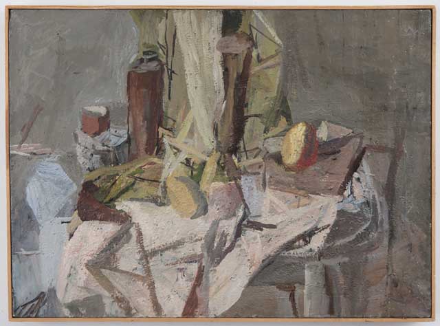
Morning Still-Life, oil on wood, 40 x 31.5 cm, 2006
It’s the same with being on the fringe here in Israel. I think there might something fresh and unique going on here, with this new trend in Israeli painting that I happen to be a small part of. I have boundless admiration and an almost automatic empathy with the particular strain of Spanish painting and sculpture that manifested itself in Antonio Lopez and his compatriots, and the generation that they have taught and influenced, and I see a lot of parallels with what is emerging now in Israel. Being secluded and somewhat cut-off might well prove to be a blessing in disguise.
What the Madrid realists have and we don’t, though, is the Prado! I’ve always felt that one of the major obstacles to the emergence of real, top-notch painting in Israel is the almost complete absence of prime examples—not to mention great collections—of painting and sculpture from the various peaks of the tradition of Western art from the Renaissance to the 20th century. I have, and continue, to try to do my best to rectify this lack by traveling to and staying for extended periods in the vicinity of great museums.
I’ve felt this even more acutely after coming back last year from Berlin where I spent a month copying from originals in the Gemaldegallery, with a number of select students. It wasn’t just the paintings I copied myself (a Rembrandt self-portrait and a Holbein portrait). We immersed ourselves in this superb collection—arriving every day before they opened the doors, leaving only at closing time—for a whole month. You’re not even looking at the paintings, you just walk by them and they radiate you with their Presence, and you absorb that. You only realize how much you have absorbed when it is over, like coming back home from a day at the sea-side.
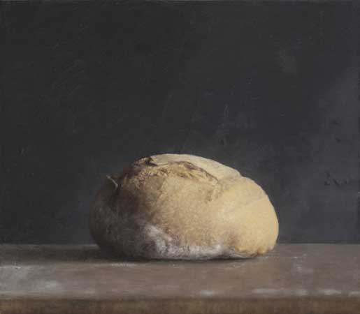
![]()
Loaf of Bread, oil on wood, 35 x 40 cm, 2011
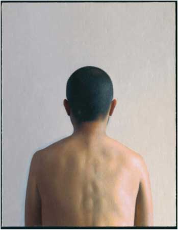
![]()
Self-portrait (whoever’s looking at me from behind), oil on canvas mounted on wood, 90 x 70, 2009
 alt="" />
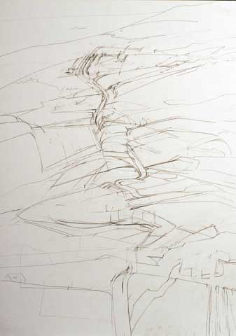


 is a lesson in and of itself. I am very interested in what happens when I allow myself to turn my head as I paint. Certain lines in nature, for example the side of a building, are, in fact, straight, yet when rigorously measured they curve visually. Painting as you turn your head increases this curve. The subtle and interesting question posed to me by Downes’ work is: What happens if this visual curve is painted as a straight line? Realizing that other elements must “distort” to compensate (much as Greenland triples in size on a flat map) gave me the creative freedom to rigorously distort based on intuitively inspired measurement. The basic idea is, if you stretch one thing in an image, it drags other things along with it.